
At a glance
The problem
Collecting every KYC detail before anyone reached the platform was a business requirement, not an accident. The reasoning was sound on its face: verify first, and every account on the platform is a verified one.
What it produced was drop-off. Plenty of companies did not have those documents to hand at the moment they were signing up, so the flow stopped there. We were not losing people who had decided against Bujeti. We were losing people who had decided for it and could not finish, which meant the requirement was buying clean data on a shrinking number of accounts.
The flow also asked everyone for the same things, regardless of what they had come to do. A company that wanted to track expenses on accounts it already had was put through the same document wall as one that wanted corporate cards and a funded business account, even though only the second legally required it.
KYC is not a form we chose to add. Bujeti moves company money, and verification is a legal condition of doing that. The requirement was fixed. Where it sat in the journey was not.
Research and approach
I mapped the existing flow and walked it through with the whole product team, including marketing, sales and customer support, since those three fielded the abandoned sign-ups and knew where people gave up and why. Alongside that I benchmarked onboarding across SaaS and fintech, looking specifically at how regulated products handle verification without losing the trial.
The question that reorganised the project was not how to shorten the form. It was which features actually require which documents. Once that was written down as a matrix rather than assumed, it was obvious the product had been charging every user the highest price in the list.
The decision: access is a ladder, not a gate
I split one hard boundary into three soft ones. Sign up and you are in. Upload a single document, the CAC certificate of registration, and basic features open. Complete full business KYC and the regulated surfaces open: a dedicated Bujeti account, corporate cards, advanced reporting.
The intent question is what makes the ladder work. Asking which features someone plans to use lets the product derive their document requirement from their own answer, so nobody is asked for paperwork a feature they will never open happens to need.
Three tiers means partially verified accounts are now a permanent state the whole product has to handle, every feature needs to know which tier it belongs to, and support has to be able to explain why something is locked. It also creates a population who use Bujeti indefinitely without ever finishing KYC. I took that trade because a lead inside the product is one we can still convert, and an abandoned sign-up is gone.
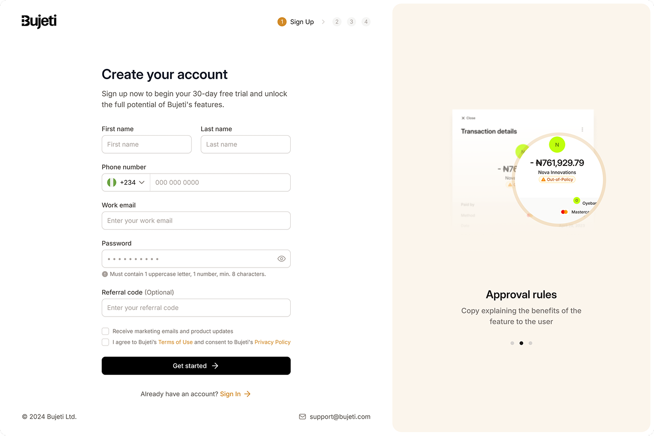
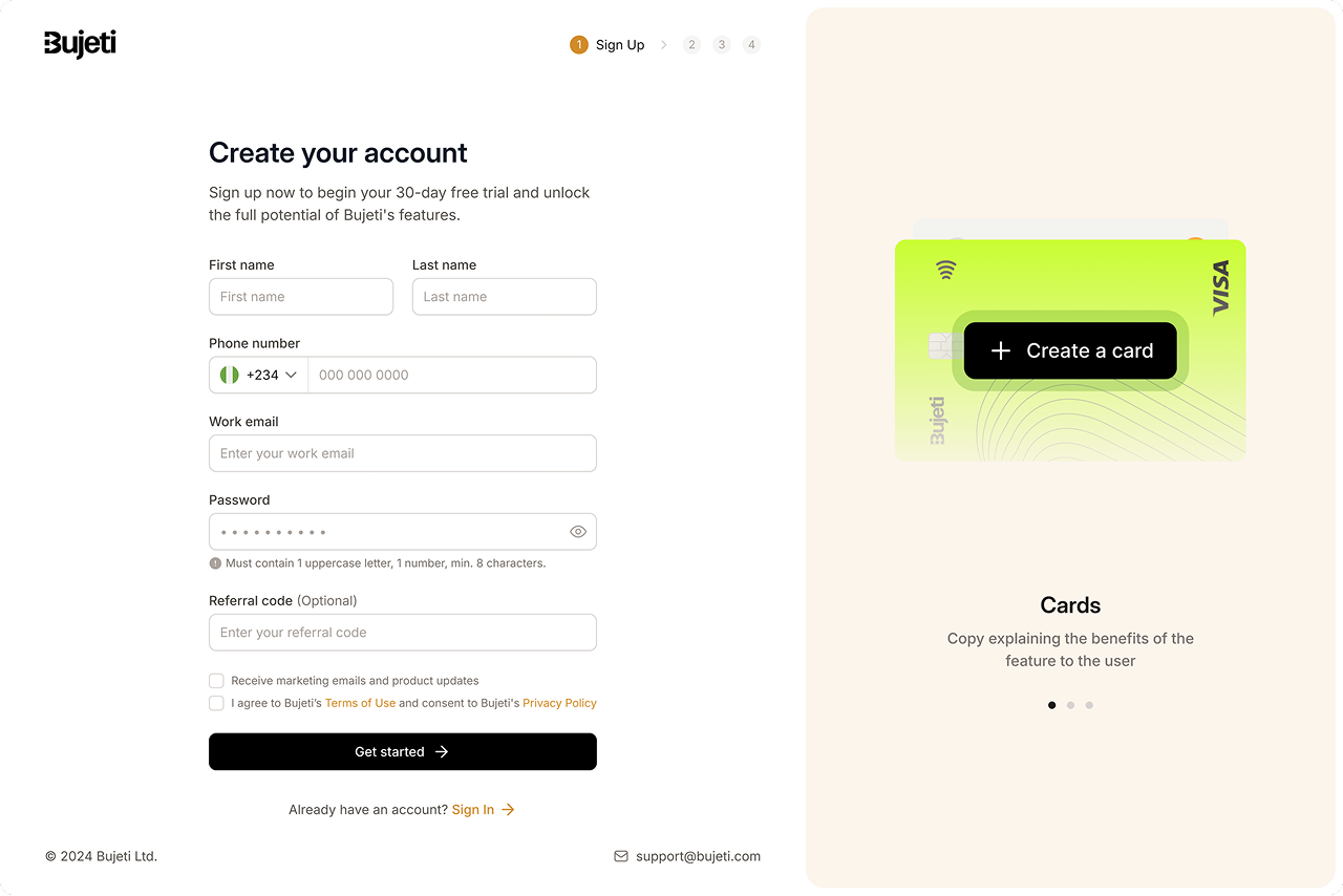
Sign-up asks for a person, not a company
Four steps, numbered, so the length is known before it starts. The first screen collects only what identifies a person and opens the 30-day trial. Marketing consent and the terms agreement are separate checkboxes rather than one bundled tick, because consenting to be emailed and agreeing to terms of use are two different decisions and only one of them is required. The panel alongside carries product value while the form is being filled, so the moment of highest effort is also the moment we make the case.
One question that does two jobs
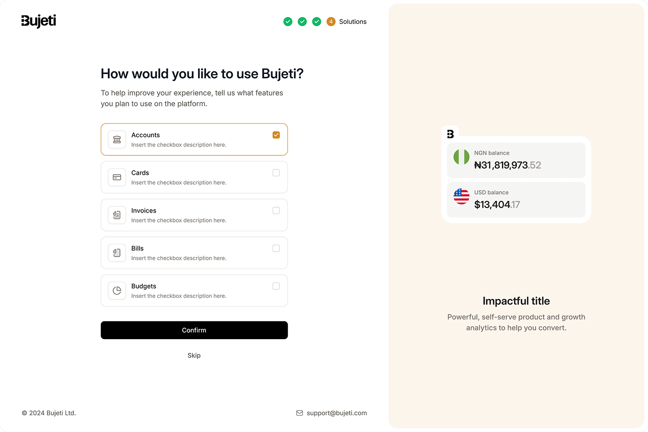
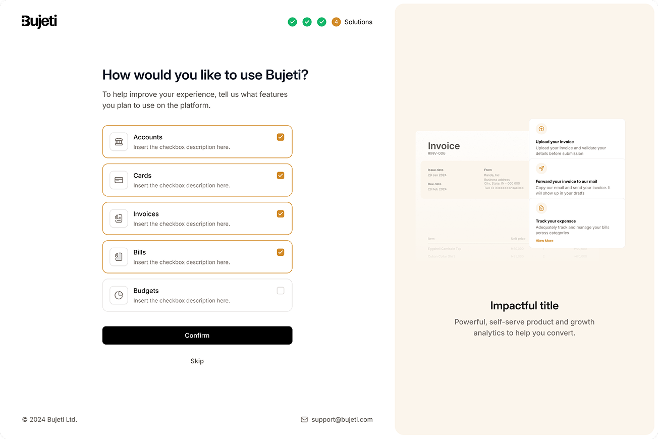
The last step asks how the company plans to use Bujeti, across accounts, cards, invoices, bills and budgets. To the person answering it reads as personalisation. Underneath, it is the input that decides which documents they will be asked for and which tier they land on.
It is skippable on purpose. This is the last screen before someone gets in, and it was not worth reintroducing a wall to protect a question that only improves the experience. A skip falls back to the lightest requirement, which is the same place a cautious answer would land.
Inside first, verified second
The user lands on a working product with the full navigation in front of them. The banner asks for one named document, the CAC certificate, and says what it buys. Under it, the setup checklist gives the account a shape: complete KYC, invite the team, add funds, connect a bank, create a card.
Only KYC carries a primary button. Everything else is secondary, so the list can be long without being ambiguous about what matters, and it carries a time estimate rather than an open-ended commitment.
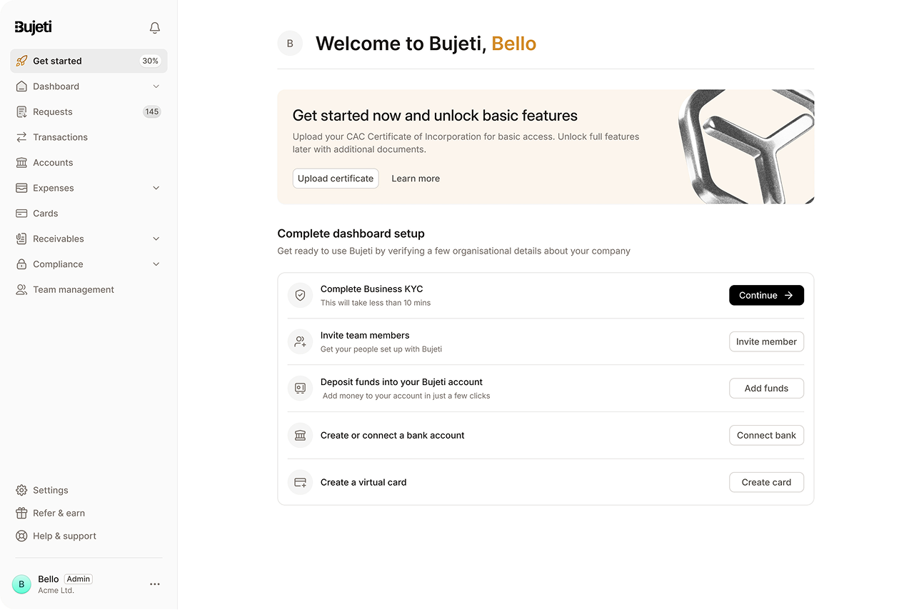
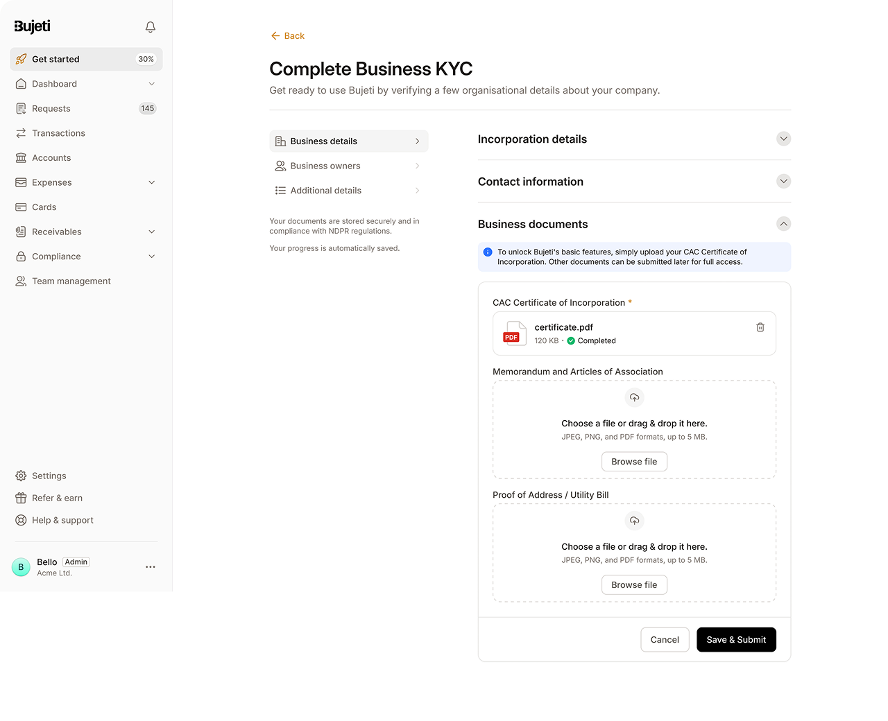
The banner rewrites itself as you climb
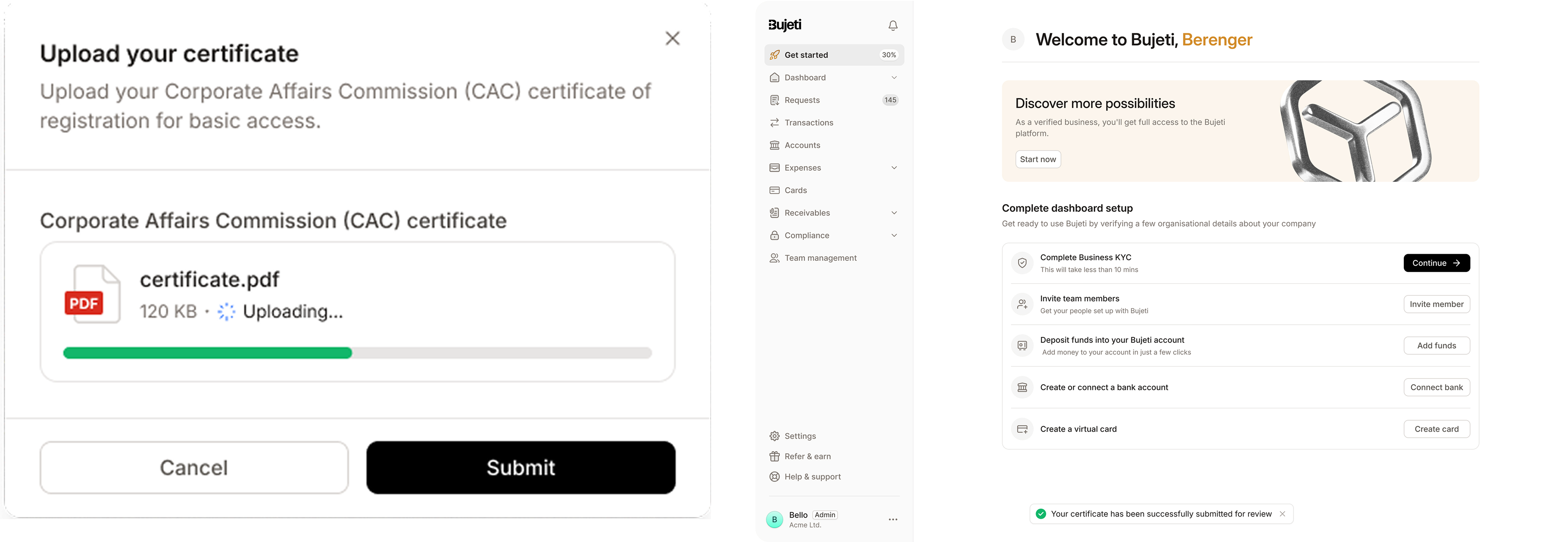
The upload asks for one file and names it precisely, so nobody has to guess what a Corporate Affairs Commission certificate is or whether the thing in their downloads folder counts. Submission returns a confirmation that it is under review rather than silence.
Then the surface changes. The banner that read unlock basic features becomes discover more possibilities, and points at full verification. The same piece of screen is the rung the account is standing on, and it re-renders to show the next one up rather than sitting there as a static advert.
The interruption arrives at the moment of intent
Deferring KYC only works if there is a moment that brings it back, and the right moment is when someone reaches for a feature that needs it. They have shown intent, so the request is now about something they want rather than a form standing between them and the product.
The prompt is written in what verification opens: a dedicated business account, corporate cards for the team, advanced expense reporting. It never says what they are not allowed to do. Same requirement, argued from the other end.

How I worked
- Reopened a settled business requirement, using the drop-off figures to make the case that verifying everyone up front was costing more accounts than it was protecting
- Took a brief to shorten the form and returned an access model, after establishing which features genuinely required which documents
- Reviewed the flow with marketing, sales and customer support, who between them had the clearest picture of where sign-ups died
- Benchmarked regulated onboarding across SaaS and fintech to see how others sequence verification against the trial
- Ran testing with users, engineers and customer success, then worked with marketing on a launch that explained the new tiers to existing accounts
Outcomes
increase in subscription conversion, against the drop-off that opened the brief
lift in feature adoption after onboarding, which is the intent question doing its second job
Early-stage churn fell measurably. The accounts that reached the product before being asked for paperwork were the ones that stayed long enough to find a reason to.
Reflection
I was asked to make onboarding shorter, and the thing that worked was not making it shorter. The same questions are still there and the same documents are still required. What changed is when they are asked and what the person has in hand by the time they are asked.
The move that carried the result was refusing to treat a legal requirement as a single event. Verification could be staged, and once it was staged each stage could be attached to the thing that justified it.
I made the intent question skippable and never measured how many people skipped it. The entire tiering model reads from that answer, so a high skip rate would mean most accounts were being routed by a default rather than by intent, and the 15% adoption lift would be coming from somewhere other than where I think it is. It was one event to instrument and I did not ask for it.