At a glance
The problem
ARM had spent three decades building trust with Nigerian wealth — across five business segments: securities trading, robo-advisor, savings, pensions, and asset management. With over ₦500 billion (~$1.1B+) in assets under management, ARM was Nigeria’s largest independent asset manager.
But customers experienced these as five standalone apps and portals, each with its own login and brand. A pension contributor couldn’t see their mutual fund. A stock trader couldn’t see their treasury bill. The business was losing share to digital-native fintechs.
Dormant accounts due to lack of digital innovation
Revenue driven by only one of five segments
Customers reliant on physical branch interactions
“How might we turn five products that behave like five companies into one relationship a customer trusts with their whole financial life?”
My role
I led the end-to-end design — from strategy through execution to post-launch monitoring, across web, mobile, and the marketing site. I set the design strategy, defined the information architecture, established UX and UI guidelines, ran usability research, managed stakeholders across five business segments, and led design reviews for the team.
Defining success
Before designing a screen, I anchored the team on five KPIs. Every design decision was scored against them.
Cross-selling & acquisition
% of users engaging with multiple products across the suite.
Churn rate
Retention across the platform over time.
Activation rate
% of new sign-ups actively engaging with product offerings.
Customer satisfaction (CSAT)
Survey-measured satisfaction with the new experience.
Brand visibility & perception
Recognition impact of the unified identity.
Who I designed for
These four came out of the profiling assessment — and they’re why “application personalisation” became a principle: the same screen re-weights itself by archetype.
The First-Timer
New to investing, cautious, unsure where to start. Plain language, low minimums, “just tell me what to buy.”
The Delegator
Wants their money to grow without the day-to-day work. Trusted, risk-matched recommendations; set-and-forget.
The Active Investor
Confident and hands-on — trades stocks, watches the market. Real-time data, depth on every position, fast execution.
The Long-Term Planner
Building wealth and retirement over a long horizon. A whole-portfolio view, guidance, and products that compound.
Research
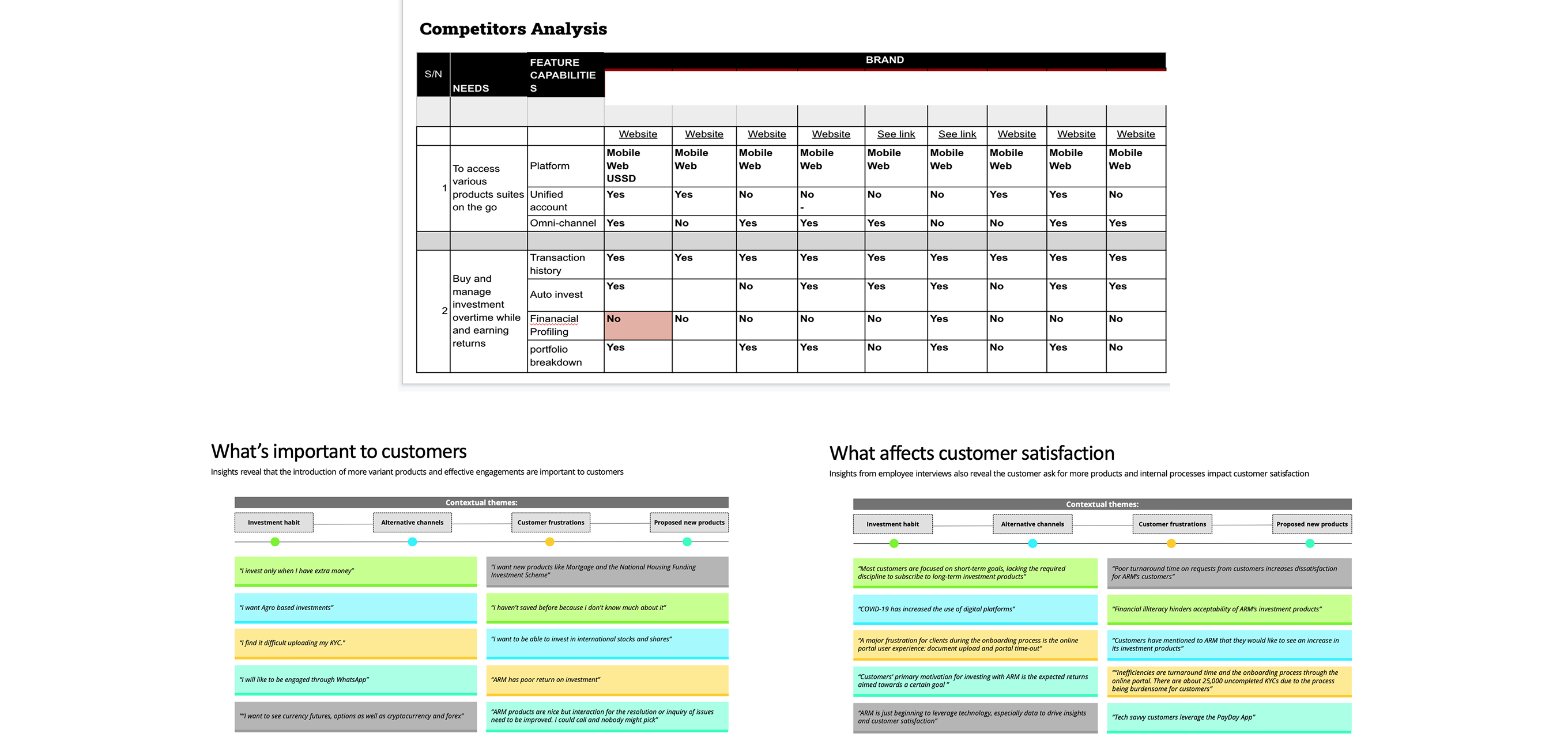
I ran mixed-methods research in collaboration with the business analyst and product manager — qualitative interviews with employees and customers, a quantitative survey to ARM’s entire customer base, and a structured competitor audit.
Employee interviews (sales, CX, biz dev)
Customer in-depth interviews
Survey responses from the customer base
Competitors analysed (direct & indirect)
“I started investing so I could give my children the kind of education and life I didn’t have. I just need it to be easy — and I need to trust the people holding my money.”
— Customer interview, Lagos
Design principles
I codified five non-negotiable principles before drawing a single screen. Every design decision had to pass these.
Future-proof & flexible
A foundation that adapts to new products, channels, and customer expectations without re-architecting.
Reduce cognitive overload
Never overwhelm. Simplify workflows, surface only what matters at each step, give clear guidance.
Application personalisation
Use customer data responsibly. Tailor the experience to risk profile, horizon, and goals.
Simple & consistent
One visual language across web, mobile, and brand. Eliminate the cognitive cost of context-switching.
Accessibility for all
Usable by people of all abilities. Contrast, semantics, motion — designed in, not bolted on.
Voice & copy principles
The legacy ARM brand spoke in the register of an investment-bank press release — formal, distant, careful. The customers we were trying to win and keep wanted the opposite. I established five copy principles and held the team to them on every screen.
Never blame the user
Error messages explain what happened and what the user can do next. “Invalid input” became “We need a valid Nigerian phone number to send your OTP.”
Numbers first, story second
“₦47,210 today · 0.39%” is the format — not “Your portfolio increased by 0.39% today, equating to ₦47,210.”
Explain the why, not just the what
A “Tier 1” badge links to a one-line explanation of what Tier 1 means. A “Money Market Fund” recommendation carries a one-line description.
Pidgin-safe English
Idioms and slang that wouldn’t carry across Nigerian, Kenyan, and Ghanaian English got cut. “Let’s go” stayed. “Crushing it” got cut.
Calm verbs over hype verbs
“Earn” not “Skyrocket.” “Grow” not “10×.” “Invest” not “Make money work for you.”
Information architecture
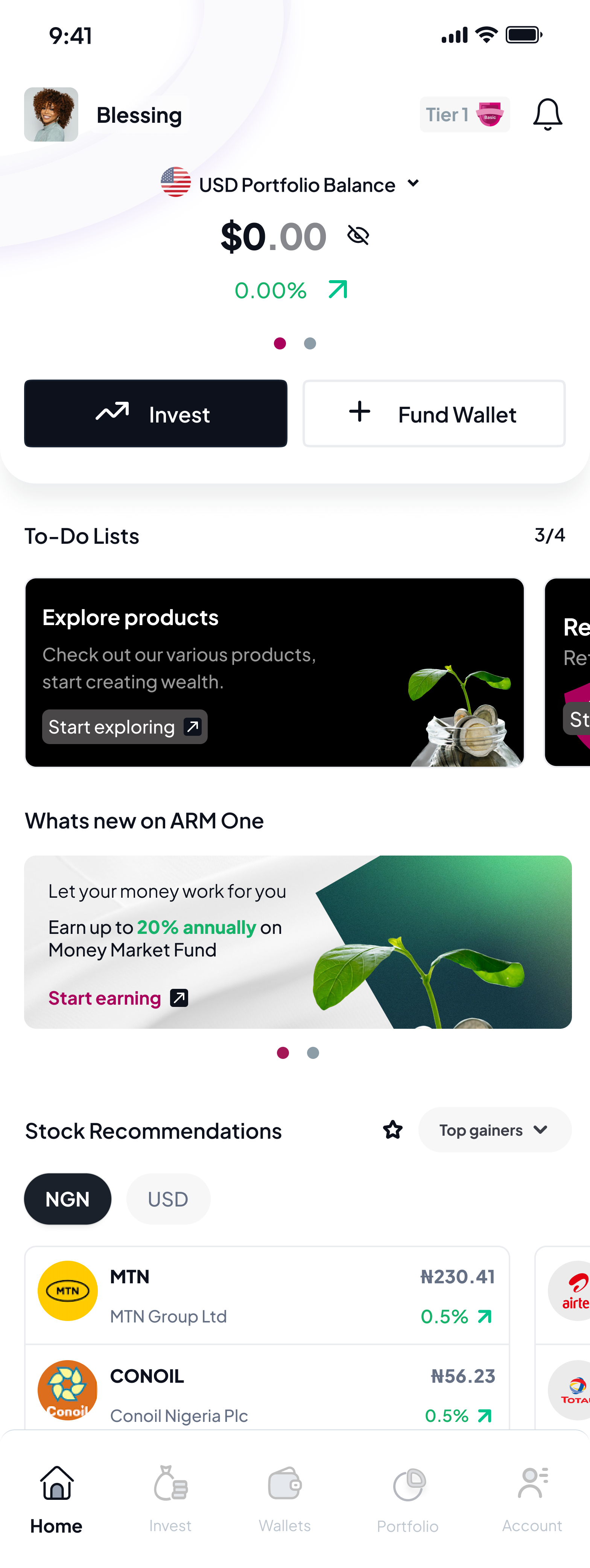
I designed a compact, flexible IA with five bottom-nav destinations — Home, Portfolio, Explore, Support, Profile. The structure could absorb any future product without restructuring.

Customer journey map
I mapped a five-stage customer journey — Research, Onboarding, Purchasing, Post-Purchase, and Ongoing Engagement — documenting at each stage what customers were doing, thinking, feeling, and the design opportunities I’d target.

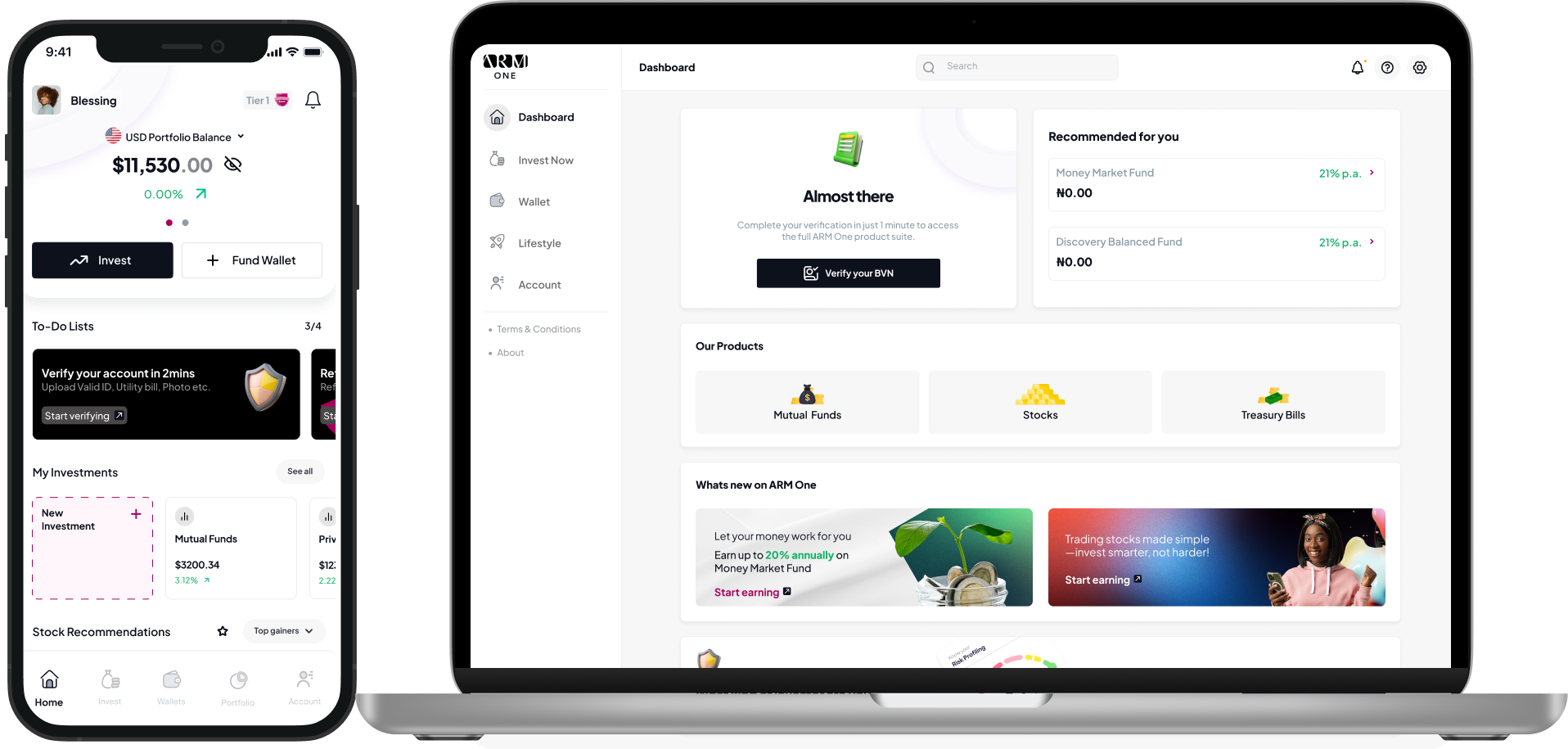
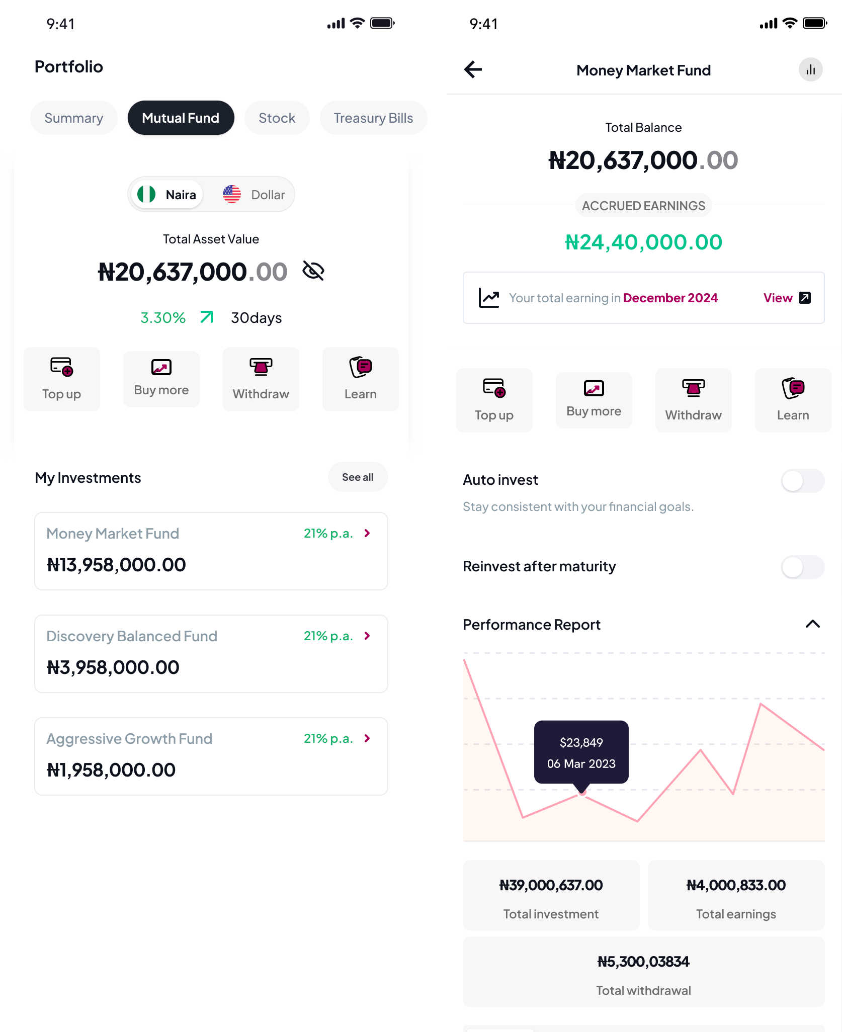
One dashboard, four products
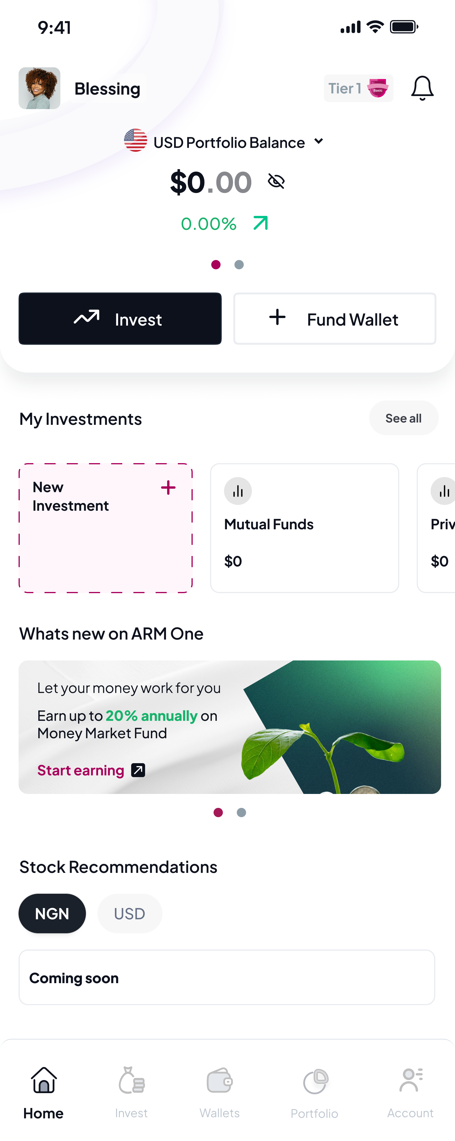
Customers used to log into separate apps for the entire ARM suite. I designed a single unified dashboard showing every product side-by-side — with allocation context, performance over time, and a recommendation layer driven by the customer’s risk profile.
The shift wasn’t visual — it was strategic. Once customers could see their whole financial picture in one place, cross-segment engagement became natural. This became the foundation for the +45% cross-segment engagement lift.
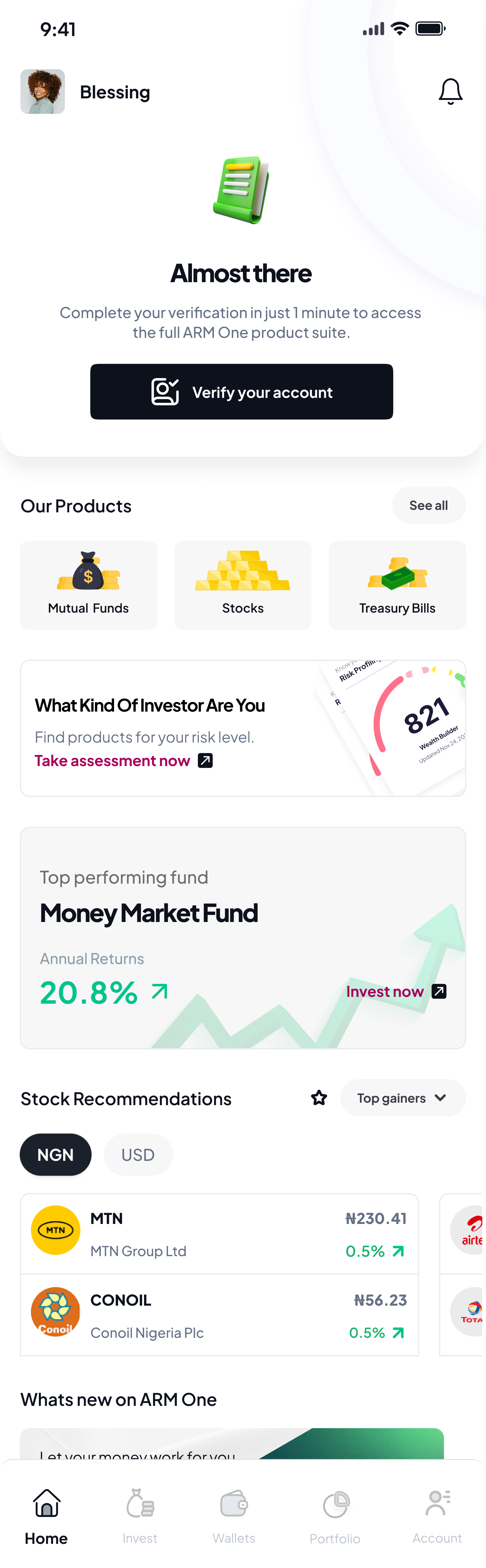
Tier-aware onboarding that doesn’t surprise
Usability testing surfaced a painful pattern: customers were only discovering platform tier limits at the moment they tried to invest more — drop-off at the worst possible moment. I redesigned the success state of onboarding to surface tier status upfront, with a one-tap path to upload Tier 3 documents.
I also split the dashboard for new vs. existing customers — the same screen had been trying to serve two very different jobs. Registration completion went from 52% to 76%.
The Robo Advisor — turning paralysis into a path
Customers told me, again and again: “I don’t know what to buy.” So I designed a five-minute Investment Profiling assessment — five questions on income, time horizon, risk appetite, and goals — that outputs a personalised risk profile (Conservative, Balanced, Aggressive) and three matched product recommendations.
The Robo Advisor became the bridge between sign-up and first investment, and the foundation for the +40% retail participation lift across Securities trading and the self-directed product set. Re-takeable every six months as life changes.
Stocks — three views for the most active product
Stocks customers are almost exclusively the Active Investor archetype — they need real-time data, depth on every position, and tools to manage what they already hold. A single page can’t do that work without becoming overwhelming. I designed a three-level progressive disclosure where each surface answers one specific question.
Invest
“What’s the market doing?”
Market context above the fold — Top Gainers, By Volume, By Value, sector browsing. Personal context immediately below. In-app News & Insights from ARM’s research desk.
Portfolio
“Where do I stand right now?”
Balance, GAINS/LOSS, four-action row (Buy more · Orders · Alerts · Research). No marketing CTAs in the middle of portfolio management.
Stock Details
“What is this position really doing?”
The full breakdown without progressive reveals — Commission, Brokerage, Price change, Profit, Total purchase, Total gain/loss. Active investors trust apps that show them the math.
A wallet that learned, and product-page levers that earned the conversion
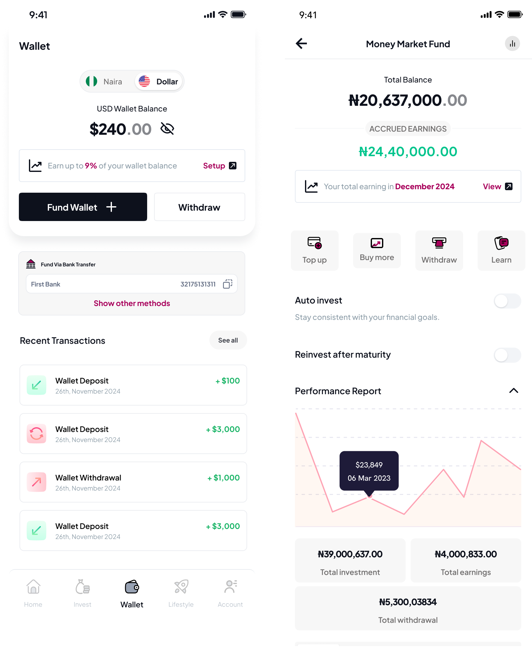
The Wallet became the financial hub. One balance, one set of controls, one place to top up from anywhere. I designed the funding sheet to sort payment methods dynamically by a 24-hour reliability score for that customer’s network (debit card, bank transfer, USSD, direct debit) — so the option most likely to succeed was always at the top. Payment success rate climbed from 32% to 47%.
Idle wallet balance earns its keep. Funded-but-not-yet-invested cash isn’t dead — it earns a base yield (up to 9% on USD) with a one-tap opt-in. The wallet itself becomes a soft money-market-lite product, creating a natural on-ramp from funded → earning → invested.
Auto-invest and Re-invest after maturity, surfaced on the product page. The team wanted auto-invest at sign-up. I held the recommendation back until the moment after a customer’s first successful manual top-up — when behaviour was established and trust was earned. Placing it on the product page (not the wallet) tied the commitment to the product the customer had just bought, so the recurring contribution carried the same intent as the original purchase.
Product pages — same scaffold, different emphasis
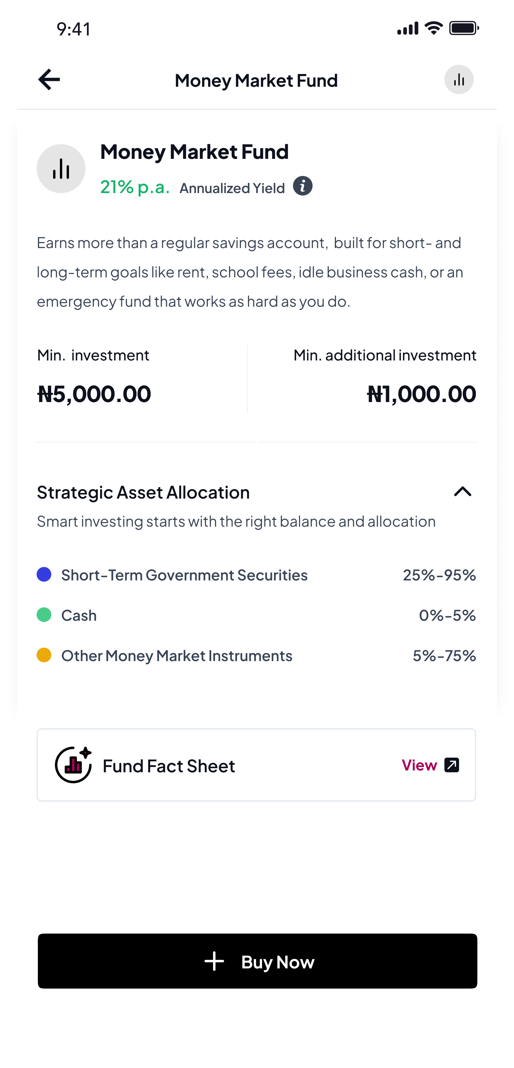
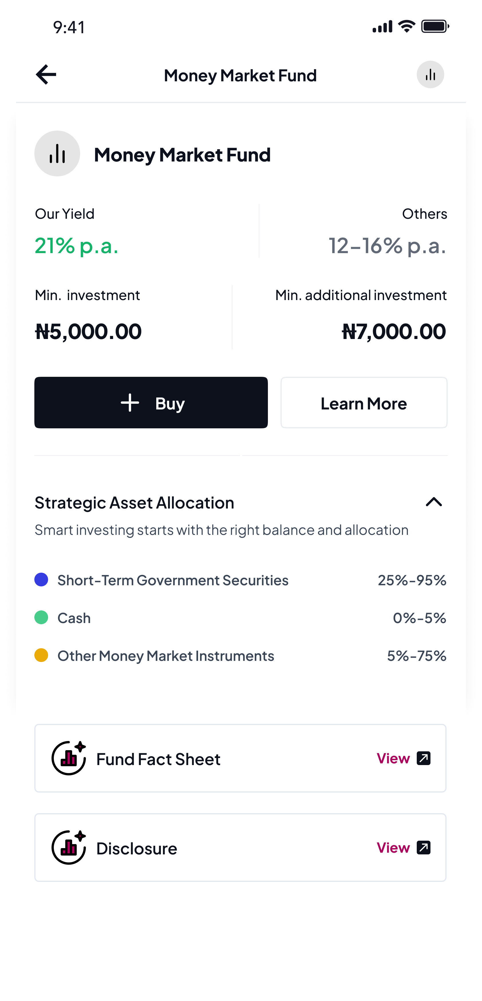
Every product page in the launched suite (Mutual Funds, Stocks, Treasury Bills) was redesigned around one principle: four actions are always one tap away, the surrounding context adapts to who is viewing. View, Top up, Withdraw, Buy — the constant scaffold. Everything else shifts per archetype.
The First-Timer sees the product explained in plain language, with Strategic Asset Allocation and Fund Fact Sheet above the fold. The Active Investor sees balance, accrued earnings, performance, and transactional actions — education collapses. The Switcher sees a comparison strip (“Our Yield 21% p.a. vs Others 12–16% p.a.”) plus Disclosure and Fund Fact Sheet trust artefacts.
Archetype came from the Robo Advisor when a customer had taken it; from a small profile-signal model (age, holdings, activity, tier, time since sign-up) otherwise.
First-Timer view
Active Investor view
Switcher view
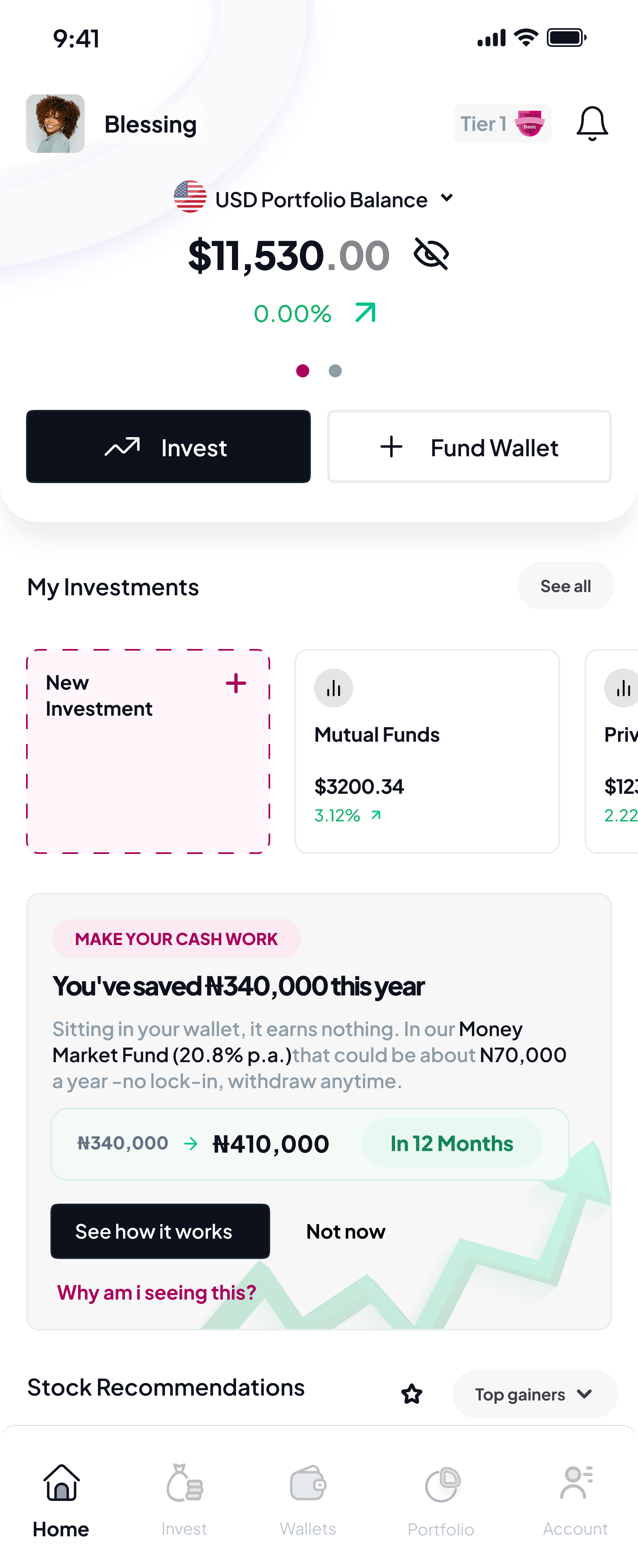
The card that turned savers into investors
Only 8% of customers held more than one product. Leadership wanted a marketing campaign — but unification had already given us the better surface: the dashboard itself. I designed a contextual “next best product” card that led with the customer’s own money — a personalised LTV projection (“You’ve saved ₦340,000 this year; it could be ₦410,000 in 12 months”) instead of generic product marketing.
I A/B tested copy and placement; the soft, trust-respecting variant beat the aggressive one — cross-product adoption climbed from 8% to 23%.
Soft · trust-respecting · won
Aggressive · pushy · lost
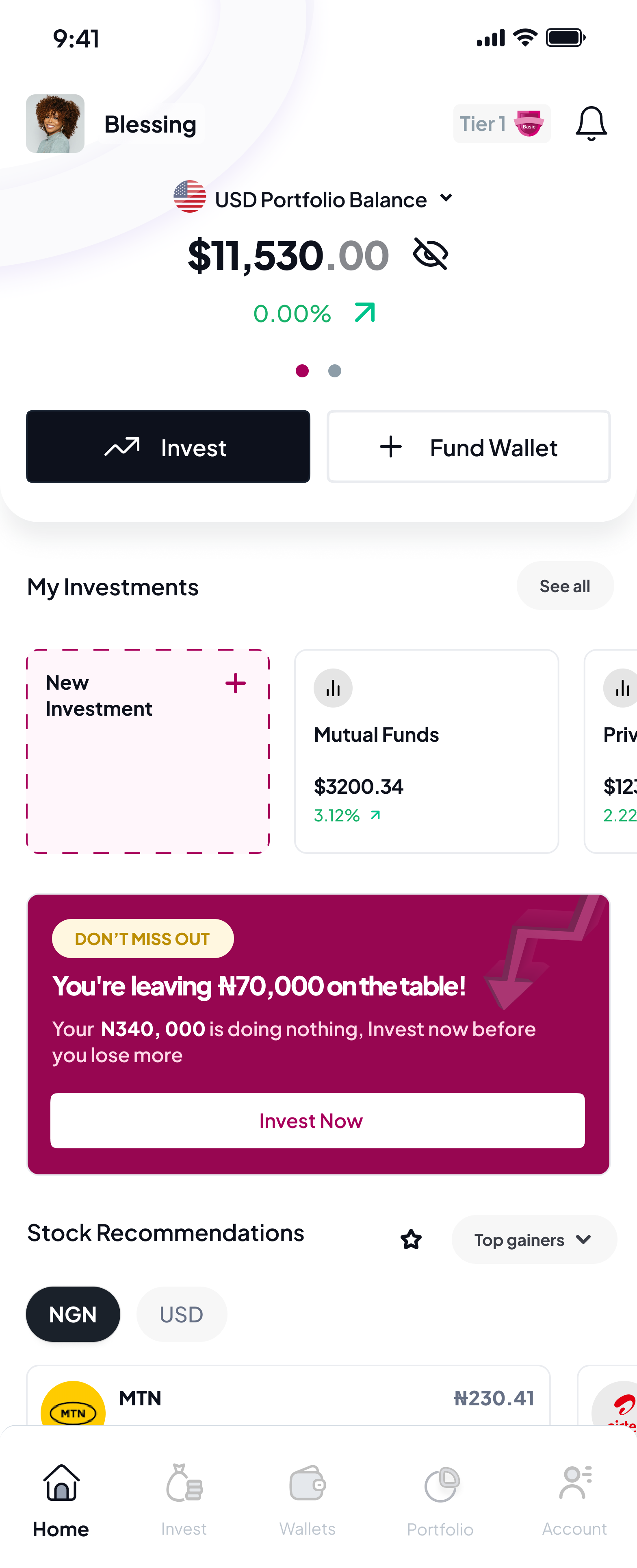
“Make your money work” framing — anchoring on the customer’s own balance with a concrete projected gain — outperformed generic product pitches. The “Why am I seeing this?” transparency link reduced dismissals; customers who understood the targeting logic were more likely to engage.
Instrumented in Mixpanel — card impression as the entry event; opened-MMF-flow, first investment, and 30 / 90-day retention as the conversion funnel.
Three versions, not one redesign
After the first build I ran moderated usability tests — 10 participants over Google Meet, recording every session. The biggest finding: one dashboard served both new and existing users, so new users logged in to a $0 shell. I shipped, watched the data, re-interviewed first-week users, then greyboxed two directions with them before committing.
V1 — the default everyone ships
One dashboard for everyone, with conditional content slots. New users saw empty zeros everywhere — it felt broken. Drop-off was real; the data sent me back.
V2 — apologise for the emptiness
A “Welcome, let’s get you started,” an honest $0, and a primary CTA to fund or explore. The greybox session confirmed it still felt like a placeholder, not a product.
V3 — a different surface entirely
The new-user dashboard shouldn’t apologise for being empty — it should be a discovery surface, not a monitoring one. Real products, top-performing funds with live returns, a BVN nudge and profiling CTA. Balance still $0 — honest — but useful immediately.
The new-user state is its own product, not a degraded version of the active one. That’s now my default.
The same sessions surfaced a second fix: tier limits only appeared when a customer tried to invest past them. I moved them into the onboarding success state with a one-tap path to upgrade — registration completion went 52% to 76%.
One system. Four teams. Still in production.
There was no design system at all. Five products, four teams — and every component (modals, status pills, money cards, fund rows) rebuilt from scratch, slightly differently, each time. No shared foundation, no governance, nothing to inherit.
I built it from zero — tokens, type, colour, accessibility — and grew the library component by component as the suite expanded. Just as important, I stood up the practices that never existed: weekly office hours, pairing with engineers on first implementations, every new pattern routed through me, and the why documented, not just the what.
product teams on one system
faster design time
still in production today
Heading
Body text
Caption label
How I worked
I shipped designs ahead of the engineering sprint so the team was never blocked. Usability tests ran before each build, not after, so feedback shaped the implementation instead of the post-mortem. High-fidelity prototypes during sprint planning aligned product management, design, and engineering on what “done” looked like.
For prioritisation I used an impact-effort matrix as a team exercise — I presented design options, the team voted, and we built consensus before backlog refinement. Stakeholder reviews ran on a monthly cadence with the executive team.
Phased rollout, not big-bang
The single most important strategic decision on this project was what not to migrate in the first phase. ARM is best known for pensions — a thirty-year flagship, the most trust-sensitive segment, and the most operationally complex due to PenCom regulation. The instinct from leadership was to lead with pensions. The Pensions BU lead — who’d been at ARM longer than the rest of the exec team combined — asked me in the April 2022 review why we weren’t leading with the flagship. I had three slides on cross-product validation. He left convinced. Two years later, when I transitioned out, he was the one asking when pensions would migrate.
I argued the opposite. Don’t move the crown jewel until the new home is demonstrably better than the old one. I sequenced the migration so the unified platform launched with securities trading, robo-advisor, savings, and asset management first. Pensions stayed on its existing app, untouched, while we proved the platform.
With the platform validated through +45% engagement and +40% retail participation lift, the pensions migration is the next phase — completing the five-into-one vision.
Out in the market
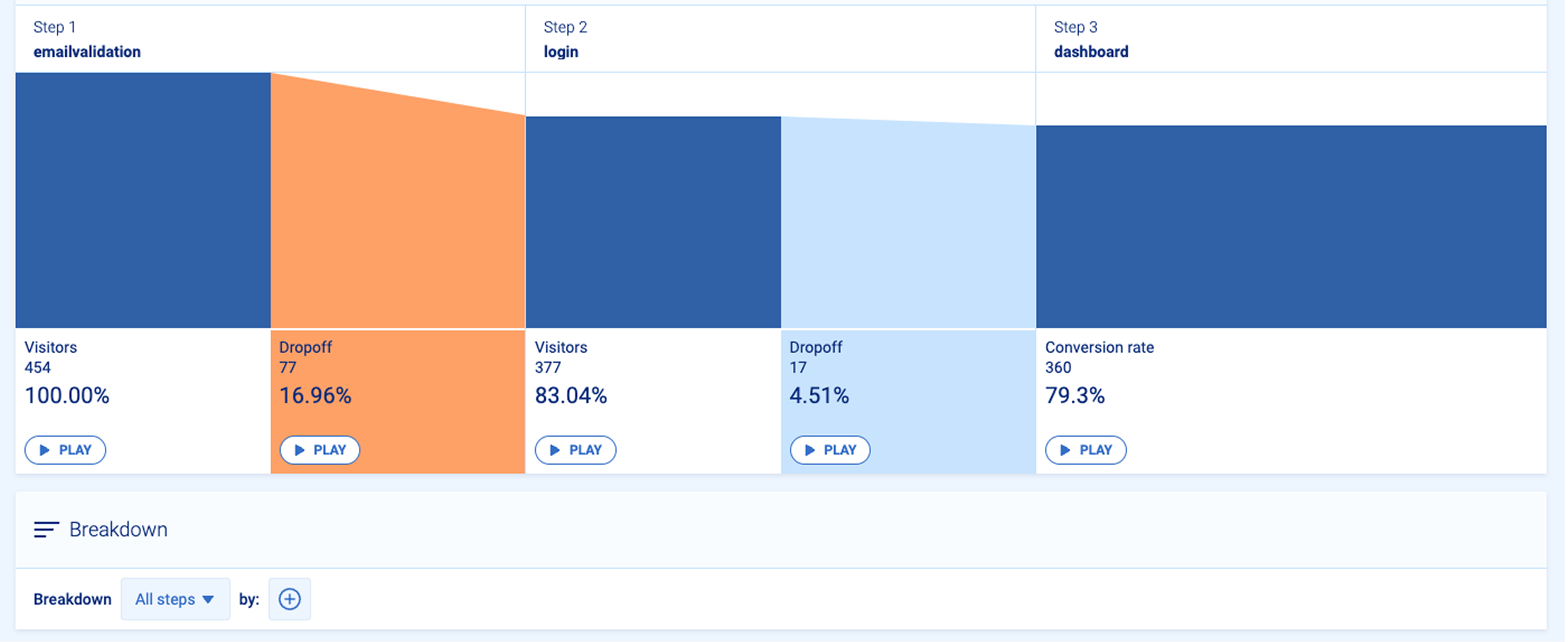
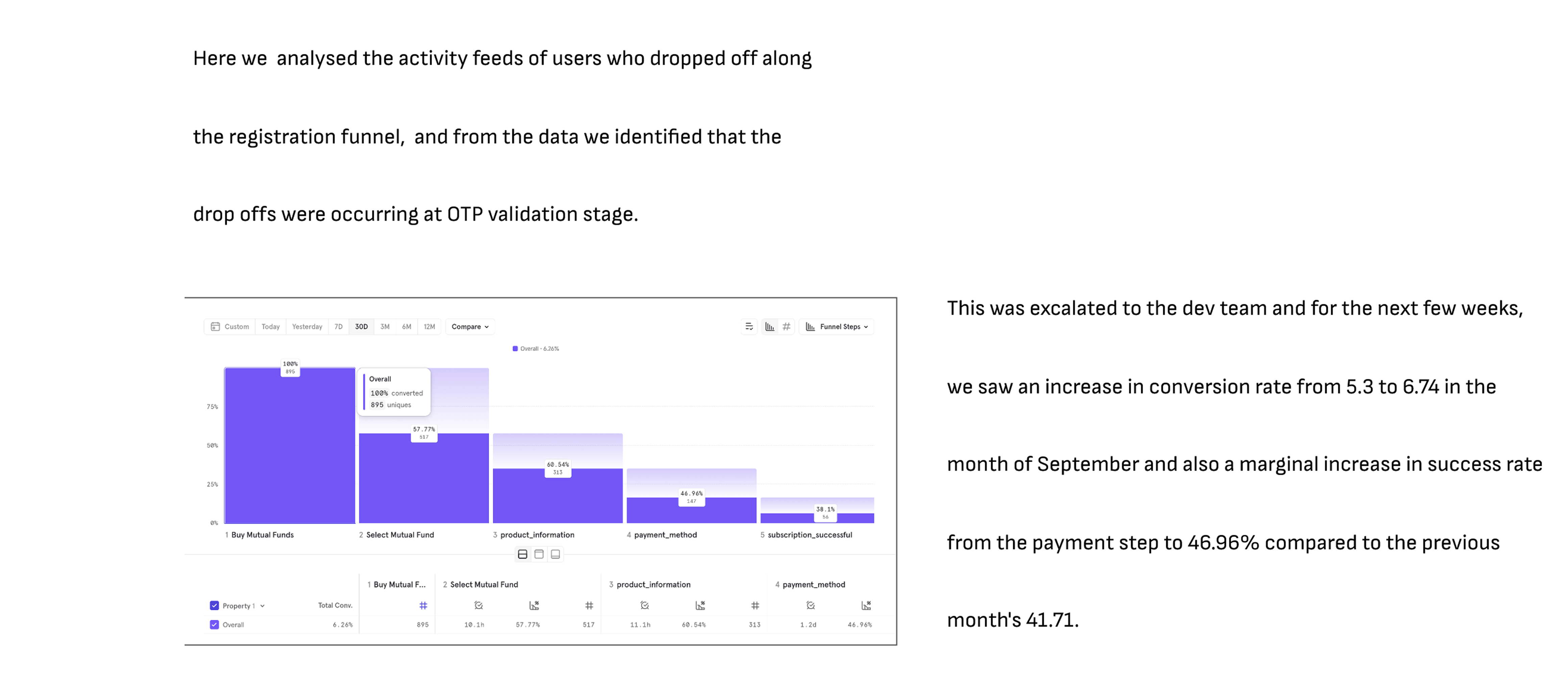
For every feature shipped I maintained ongoing monitoring in Mixpanel — activation, churn, conversion. It was a Sunday Mixpanel session — I was pulling the weekly report — when I noticed the registration funnel bleeding at OTP validation. I traced it to unreliable Nigerian telco SMS delivery, had engineering on a call Monday morning, and the fix shipped Wednesday. Conversion climbed from 5.3 to 6.74 over the following weeks.
Ship → measure → diagnose → escalate → iterate. That loop — and that cadence — is the part of my practice I’m most proud of.
Impact
The redesign delivered measurable change at every layer of the funnel — and meaningful business outcomes.
Revenue impact in year one
Sustained quarterly sales post-launch
Live in Nigeria, Kenya, and Ghana
Reflections
Challenges
- Legacy systems behind five segments meant some ideal UX patterns weren't viable in phase one.
- Five business segments, each with strong opinions on “their” product’s prominence in the unified shell.
- Designing for digital trust in an emerging market took more reassurance, education, and proof.
What I’d do differently
- Design an early-career / student-investor track from day one. I cut it in 2022 as a deliberate scope decision before a board review — and post-launch, some of our highest-engagement users were 22–26 year olds we hadn't designed for. I'd argue louder for it next time.
- Build the gamification & loyalty layer in phase one rather than deferring it.
- Invest in motion and micro-interactions earlier — they shifted brand perception more than I expected.
What I learned
- In finance, the moment of education matters more than the content — tier limits proved it.
- The new-user state is its own product, not a degraded version of the active one.
- Trust-respecting design is usually also the highest-converting design — the soft cross-sell beat the aggressive one.
Where I’d take it next
The platform is proven. The next chapter is using that trust to deepen the relationship — not just cross-sell products, but personalise the entire experience to the customer’s stage.
Migrate ARM Pensions into the unified suite — the flagship I held back until the platform proved itself. Now it can complete the five-into-one vision on a trust base that didn’t exist at launch.
Move from product-triggered cross-sell cards to behaviour-triggered ones — a customer who’s saved for six months without investing gets a different surface than one who just deposited. Plus a WhatsApp re-engagement loop for dormant accounts.
New asset classes — crypto, FX, agricultural investments — without fragmenting the platform again. The design system and IA are built to absorb them; the question is sequencing by customer readiness, not product availability.
Conclusion
ARM One was the most demanding project of my career — and the one I’m most proud of. It taught me how to lead a multidisciplinary team through a generational platform change, how to balance the politics of five business segments, and how to keep customer evidence at the centre of every decision. Five segments unified into one consumer-grade investing platform. ₦5B (~$11M) revenue generated in year one. +45% engagement. +40% retail participation. A phased pensions migration ready to complete the vision.